


Design a new logo with me!
How I designed a new logo for my business...

A logo is always crucial for businesses. It’s the trademark or symbol for the company. It’s the symbol to recognise and remember them by.
For illustrators, it’s also important to have a logo for our businesses. A logo that is eye-catching, simple yet fun and funky at the same time. A logo that will draw eyes immediately to the website and make them want to stay. It’s to spark curiosity and wonder. It is meant to make the reader wonder: Who is this person?
So, yes, I strongly believe it’s important to design a catchy and fun logo design for your own website! Here’s how I designed mine…

My old logo
I had an old logo for ages which I designed at university when I was setting up my website.

It was a good logo, I had a lot of fun creating it and I was proud of it.
However, it just no longer fitted in with my artwork anymore. I felt it was old and needed updating to fit my current style.
Now, logos are mostly vector and very graphic. Such as Coca Cola, Starbucks and more.
IMAGE of logos
There are different types of logos that big corporations use. I will go into more detail on this in another article.
For my logo, I still wanted it to have a hand-drawn appearance. To look quirky and bouncy. To look textured and cute to fit in perfectly with my artwork on my website.
So I began creating my new logo…
It begun with some loose sketches in my sketchbook to get my ideas down. And then I brought forward my favourites onto Procreate to refine them a bit more:
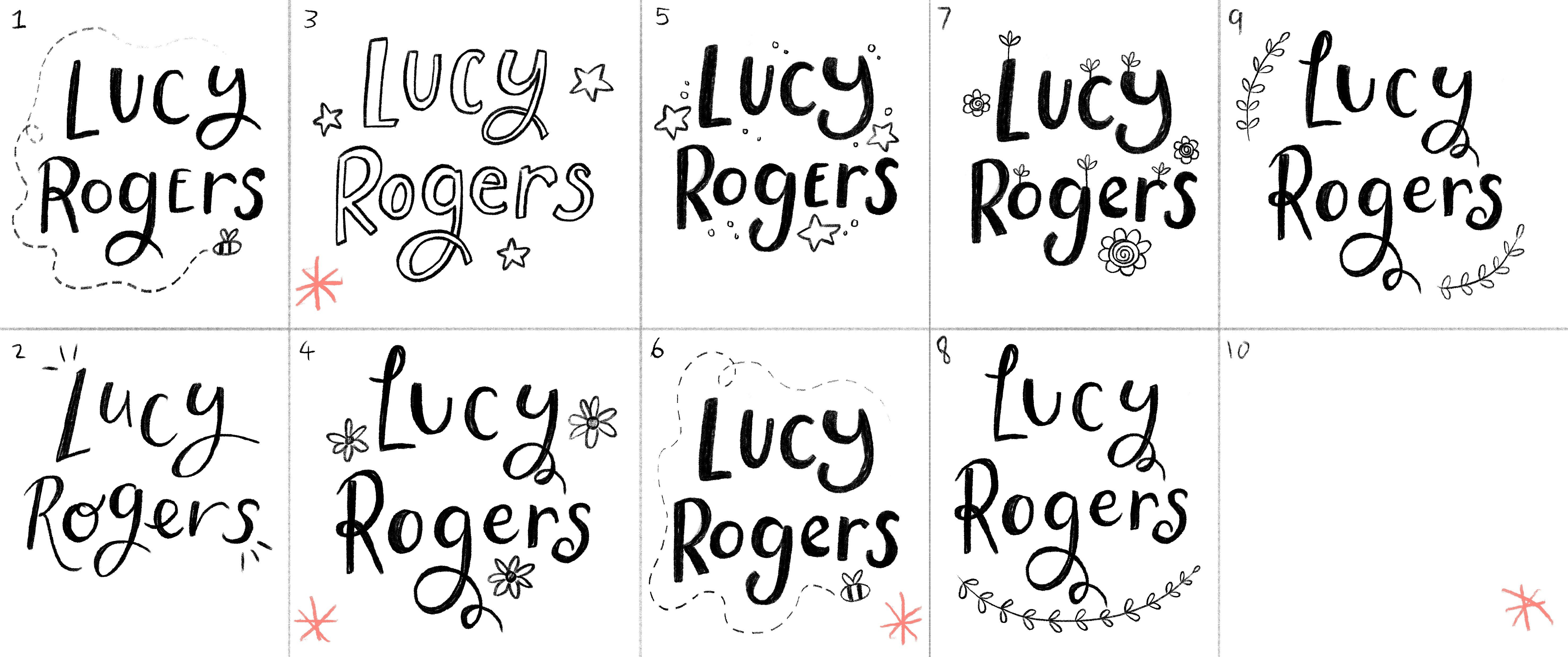
I wanted something really cute and bouncy so it’ll be eye-catching for new viewers popping onto my web page. I also wanted it to have some illustrative element to it.
I picked out some of my favourites and then developed them a bit further:
At first, I drew them out like this so I could see how they could look in a circle for icons/profile pictures on social media or for stickers in the future for an online shop.
But I needed to see how they would look lined up for the header in my website:

This design I thought is very pretty and elegant, but it just didn’t feel like me.

This one I felt was energetic and eye-catching, however it looked a bit too plain for what I was looking for.

I fitted them all on my website to see which I liked best and I chose the bottom design. I loved how bouncy and bold it is. I thought the loops in the ‘y’ and ‘g’ looked fun and felt like it matched my persona a bit more.
However, the stars were not working for me. So I set to work on trying some new things for it such as seeing how the bee would look next to it. I thought having a bee instead would be so cute as I quite often include bees bussing around in the background of my paintings.
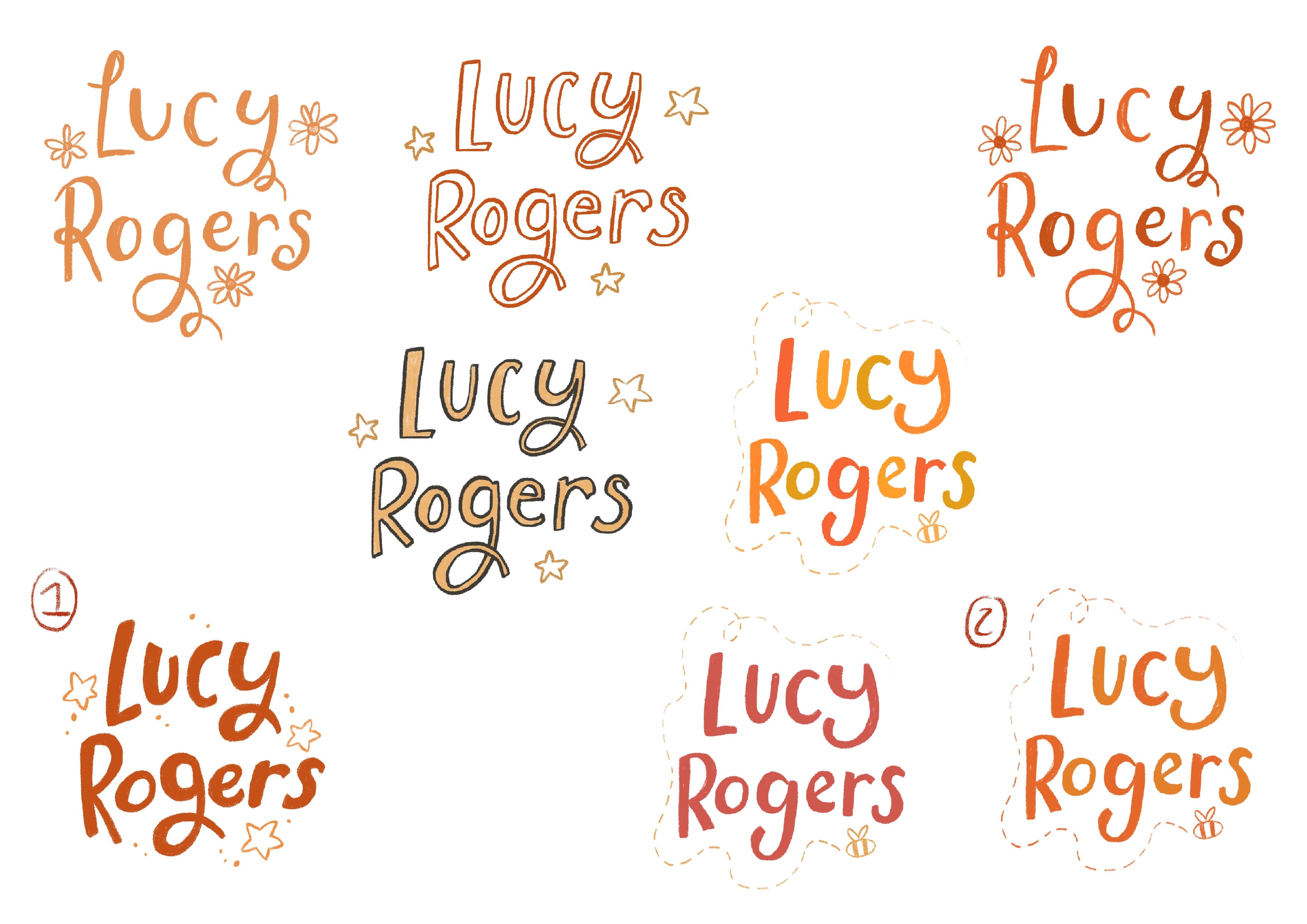
I tried some colours to see how they may look on my website home page:

I didn’t want red, as red is not really a colour you would want for a logo as its a colour for anger, so I tried some other colours but by combining several different shades of blues or orange so rather than one colour, it could be a mix…

I thought the blue looked too cold and didn’t go well with some of my artwork, so I rejected it.

I knew it was the orange colours that matched my website with the header colours I have and my portfolio pieces. It gives a warm feeling and I was really pleased with it.
So, I finished updating my new logo! It was so quick and simple to do in less than a day and I’m pleased with the updated logo now.
My next step will probably be seeing how it may look in vector in case I need it larger, or animating the logo when I next get free time. To animate it will make it even more eye-catching. But at the same I don’t it to draw away attention from the artwork, so I may not add it.
Now, I hope this has given you some idea of how fun and simple it is to design logos. I hope it has given some inspiration for you to experiment with typography and fonts for a fun project.
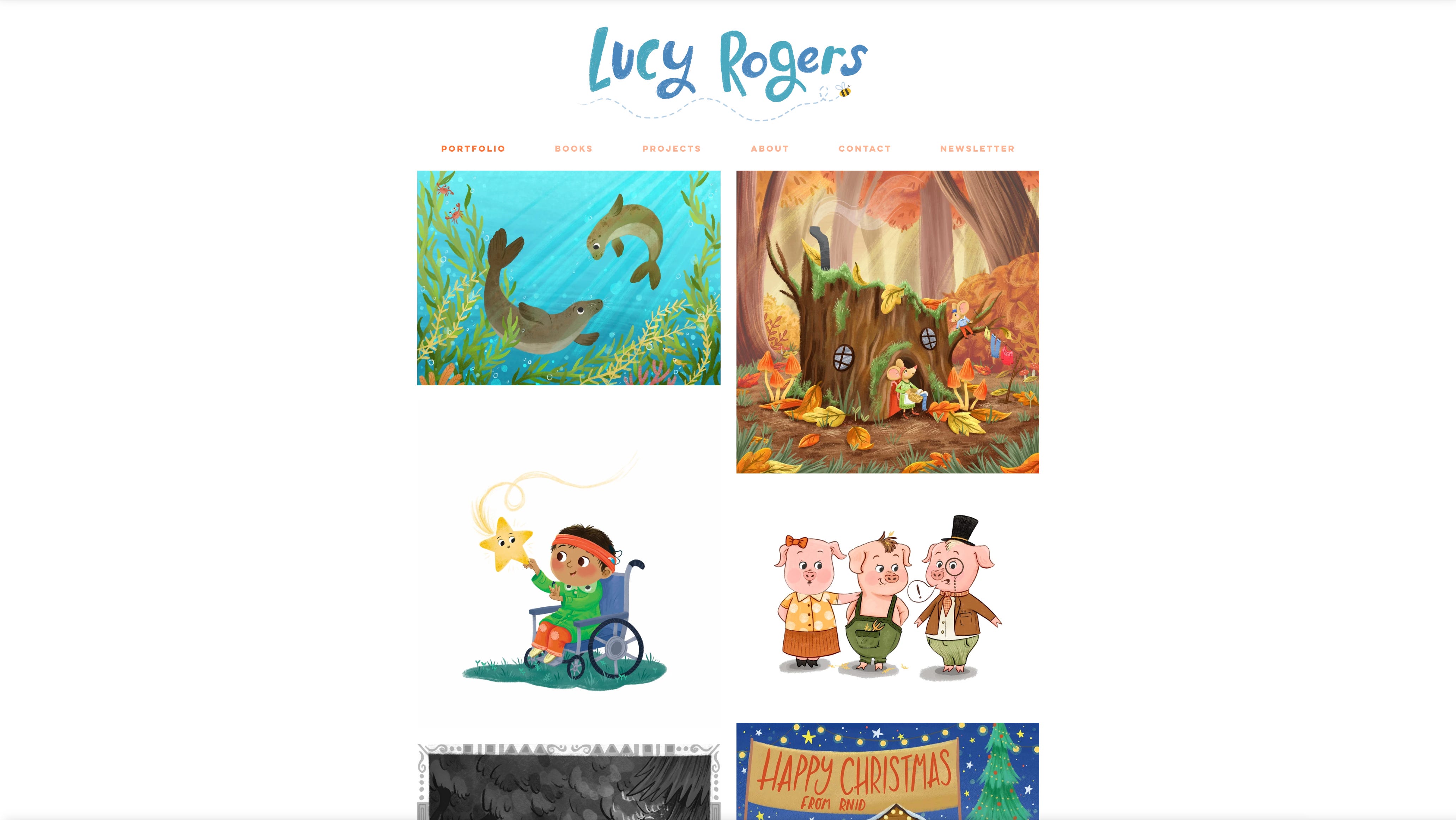
Here’s the final look of my logo:

I wanted to keep the textures in it and I used the gouache brush that I mainly use for my artworks.
Let me know what you all think!
~ Luce x
Love your new logo! I should create my own too ;)
Love your new logo!